File:3-Learning-curves-for-electricity-prices.png

Original file (2,879 × 2,478 pixels, file size: 110 KB, MIME type: image/png)
Summary
| Description |
English: Do electricity prices follow learning curves?
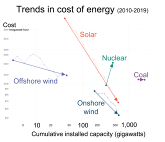
Solar PV modules might very well follow a rapidly declining learning curve, but solar modules themselves are not what we want. We want the electricity that they produce. Does the price of solar electricity follow a learning curve? The visualization shows the relevant data. On the vertical axis you see again the LCOE price for electricity and on the horizontal axis you now find the cumulative installed capacity. As in the solar module chart, both variables are plotted on logarithmic scales so that the line on the charts represents the learning rate for these technologies. In bright orange you see the development for the price of power from solar PV over the last decade. The learning curve relationship that we saw for the price of solar modules also holds for the price of electricity. The learning rate is actually even faster: At each doubling of installed solar capacity the price of solar electricity declined by 36% – compared to 20% for solar modules. Wind power – shown in blue – also follows a learning curve. The onshore wind industry achieved a learning rate of 23%. Every doubling of capacity was associated with a price decline of almost a quarter. Offshore wind had a learning rate of 10% and is still relatively expensive – only 25% cheaper than nuclear and a bit more expensive than coal. But for two reasons experts expect the power from offshore wind to become very cheap in the coming years, larger wind turbine sizes and the fact that the consistent winds out on the sea allows higher load factors. The obvious similarity of onshore and offshore wind also means that learning effects in one industry can be transferred to the other. |
||
| Date | |||
| Source | |||
| Author | Our World In Data - Max Roser | ||
| Other versions |
Français
|

|
This graph image could be re-created using vector graphics as an SVG file. This has several advantages; see Commons:Media for cleanup for more information. If an SVG form of this image is available, please upload it and afterwards replace this template with
{{vector version available|new image name}}.It is recommended to name the SVG file “3-Learning-curves-for-electricity-prices.svg”—then the template Vector version available (or Vva) does not need the new image name parameter. |
Related file
Data for four renewable sources only, updated through 2022:
-
 2010- Decreasing renewable energy costs versus deployment.svg
(Data for four renewable sources only, updated through 2022)

.png)
_for_electricity_vs_cumulative_capacity_comparing_renewables,_coal_and_nuclear_(OWID_chart).png)
Licensing
- You are free:
- to share – to copy, distribute and transmit the work
- to remix – to adapt the work
- Under the following conditions:
- attribution – You must give appropriate credit, provide a link to the license, and indicate if changes were made. You may do so in any reasonable manner, but not in any way that suggests the licensor endorses you or your use.
File history
Click on a date/time to view the file as it appeared at that time.
| Date/Time | Thumbnail | Dimensions | User | Comment | |
|---|---|---|---|---|---|
| current | 15:31, 14 June 2022 | | 2,879 × 2,478 (110 KB) | wikimediacommons>RCraig09 | Version 5: correcting color of "Solar" legend |
File usage
The following page uses this file: